


Born with a passion for hearty and savory foods is Bridge Town Pie Co. A sister company of Bridge Town Canteen, street food vendors with attitude! Rob came back to to us with a new venture in tow following the success of his first company. Similar name, but focusing on a nation favourite. The Pie!
Born with a passion for hearty and savory foods is Bridge Town Pie Co. A sister company of Bridge Town Canteen, street food vendors with attitude! Rob came back to to us with a new venture in tow following the success of his first company. Similar name, but focusing on a nation favourite. The Pie!
Client
Bridge Town Pie Co.
Bridge Town Pie Co.
Deliverables
Logo Development Brand Identity Packaging Design
Logo Development Brand Identity Packaging Design
Sector
Food & Drink
Date
January 2023

Bridging the Past and Present
Bridging the Past and Present
Rob’s brief for us was to come up with a logo that paid homage to the original logo of Bridge Town Canteen by incorporating the bridge/cutlery icon it’s most know for. But this time he wanted us to add a whimsical feel to the look by throwing a pie into the mix. Through our creative process we experimented with various styles and typography before narrowing it down to this playful, friendly, and bold concept. Here’s what we came up with.
Rob’s brief for us was to come up with a logo that paid homage to the original logo of Bridge Town Canteen by incorporating the bridge/cutlery icon it’s most know for. But this time he wanted us to add a whimsical feel to the look by throwing a pie into the mix. Through our creative process we experimented with various styles and typography before narrowing it down to this playful, friendly, and bold concept. Here’s what we came up with.


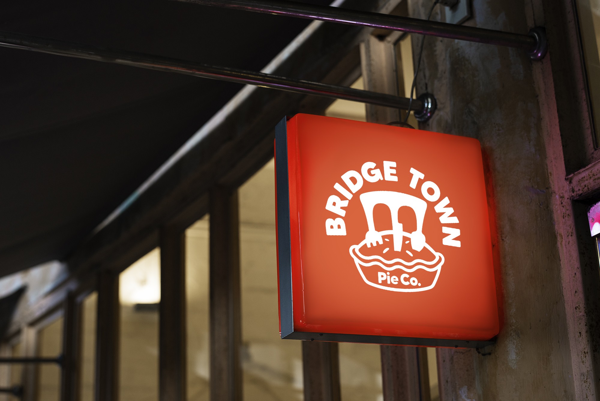
Aye, Aye — Modernising t'Pie!
Aye, Aye — Modernising t'Pie!
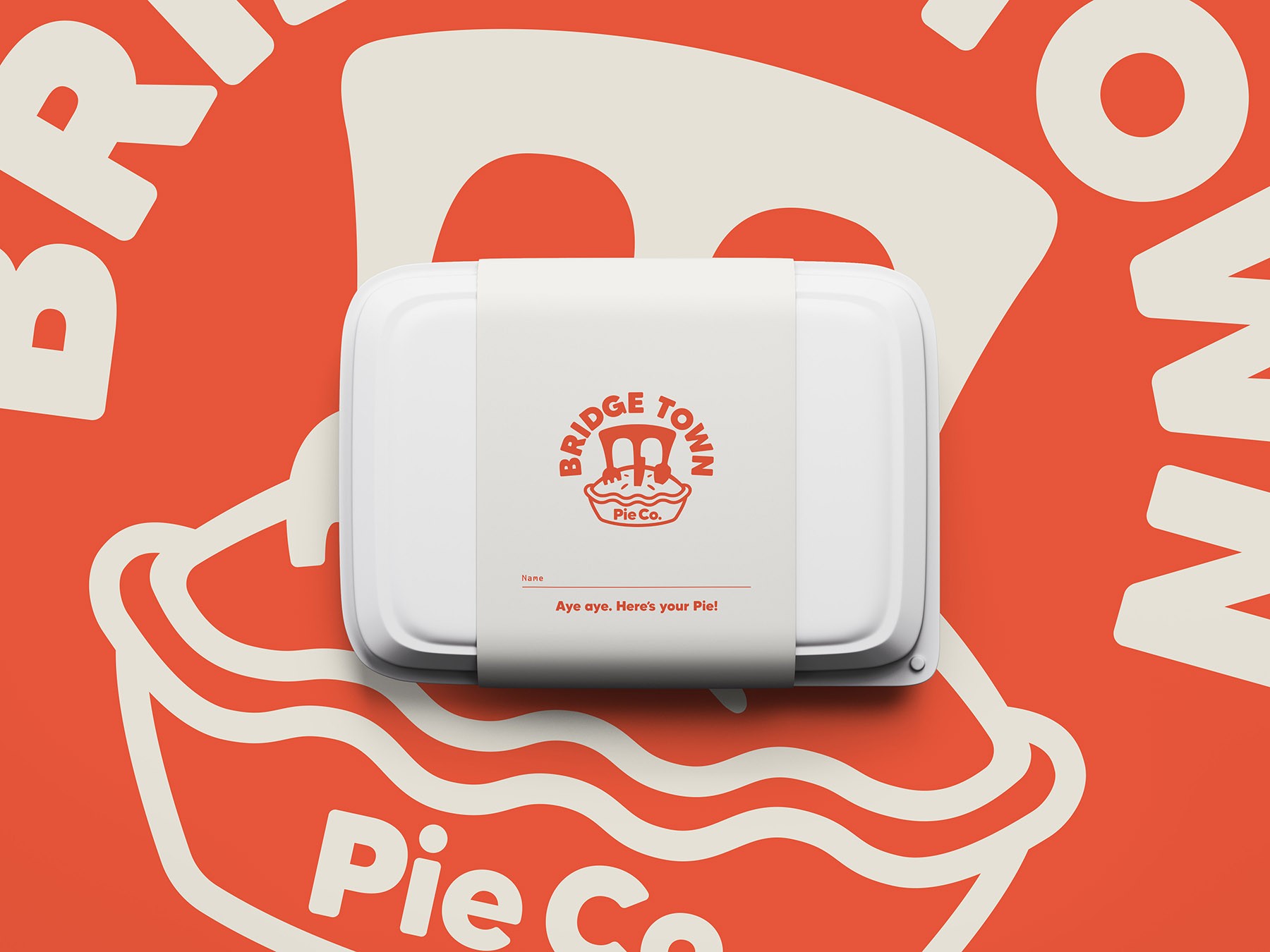
We didn’t stop at just the logo—our collaboration with Rob extended into the full brand experience. We worked closely with him to design menus, packaging, and signage that carried the same playful and inviting feel as the logo. Every element was crafted to ensure a cohesive brand identity, from the way the menu highlights the mouthwatering pie selections to the packaging that makes each order feel special. The result? A brand that not only looks great but also enhances the customer experience at every touchpoint.
We didn’t stop at just the logo—our collaboration with Rob extended into the full brand experience. We worked closely with him to design menus, packaging, and signage that carried the same playful and inviting feel as the logo. Every element was crafted to ensure a cohesive brand identity, from the way the menu highlights the mouthwatering pie selections to the packaging that makes each order feel special. The result? A brand that not only looks great but also enhances the customer experience at every touchpoint.


Client Praise
Super chuffed with the logo that Broadus Studio have produced. As soon as I described what I wanted they got it straight away and produced examples that were hard to choose from straight off the bat. Will definitely be working together throughout to get the brand going further.
Super chuffed with the logo that Broadus Studio have produced. As soon as I described what I wanted they got it straight away and produced examples that were hard to choose from straight off the bat. Will definitely be working together throughout to get the brand going further.
Rob Taylor
Rob Taylor
Like What You See?
Let's work on something great
Like What You See?
Let's work on something great

Saint Talisman
Saint Talisman
Born with a passion for hearty and savory foods is Bridge Town Pie Co. A sister company of Bridge Town Canteen, street food vendors with attitude! Rob came back to to us with a new venture in tow following the success of his first company. Similar name, but focusing on a nation favourite. The Pie!
Client
Bridge Town Pie Co.
Deliverables
Logo Development Brand Identity Packaging Design
Sector
Food & Drink
Date
January 2023
Bridging the Past and Present
Rob’s brief for us was to come up with a logo that paid homage to the original logo of Bridge Town Canteen by incorporating the bridge/cutlery icon it’s most know for. But this time he wanted us to add a whimsical feel to the look by throwing a pie into the mix. Through our creative process we experimented with various styles and typography before narrowing it down to this playful, friendly, and bold concept. Here’s what we came up with.
Aye, Aye — Modernising t'Pie!
We didn’t stop at just the logo—our collaboration with Rob extended into the full brand experience. We worked closely with him to design menus, packaging, and signage that carried the same playful and inviting feel as the logo. Every element was crafted to ensure a cohesive brand identity, from the way the menu highlights the mouthwatering pie selections to the packaging that makes each order feel special. The result? A brand that not only looks great but also enhances the customer experience at every touchpoint.
Client Praise
Super chuffed with the logo that Broadus Studio have produced. As soon as I described what I wanted they got it straight away and produced examples that were hard to choose from straight off the bat. Will definitely be working together throughout to get the brand going further.
Rob Taylor
Like What You See?
Let's work on something great
Saint Talisman