
The Big Shift to Serif Fonts in Fashion
Fashion is all about making a statement, and typography is no exception. In fact, the typeface you choose for your brand can say just as much about your style and aesthetic as the clothes you design.

Typography is a defining element of any fashion brand’s identity. It sets the tone before a single garment is seen, influencing how consumers perceive style, heritage, and exclusivity. A well-chosen typeface can instantly communicate whether a brand is timeless and luxurious or modern and edgy. Traditionally, many luxury fashion houses used serif fonts—typefaces with small decorative strokes at the ends of letters—conveying elegance, refinement, and history. Brands like Vogue and Dior have long embraced these classic letterforms to reinforce their prestige and sense of legacy. The intricate details of serif fonts often evoke tradition and craftsmanship, making them a natural fit for heritage brands. However, in recent years, the industry has seen a dramatic shift towards sans serif fonts, which lack these embellishments, offering a cleaner, more contemporary aesthetic that aligns with modern sensibilities.
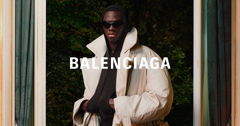
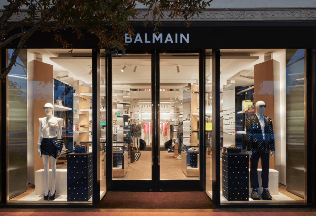
This transition to bold, minimalist sans serif typography reflects the changing landscape of fashion itself. With digital platforms dominating brand communication, sans serif fonts provide better legibility across screens, packaging, and advertising. Their simplicity allows them to be more adaptable across different media, from website headers to mobile app interfaces, ensuring a seamless brand presence. They also align with the modern, stripped-back aesthetic favoured by brands like Balenciaga, Burberry, and Saint Laurent, all of which have rebranded with sleek, no-frills typefaces. This movement towards clean typography mirrors the larger trend of minimalism in fashion, where excess detail is stripped away in favour of bold simplicity. The move signals a preference for versatility, ensuring a brand remains relevant across multiple touchpoints without the visual weight of ornate lettering, making them especially appealing to younger, digitally savvy consumers.

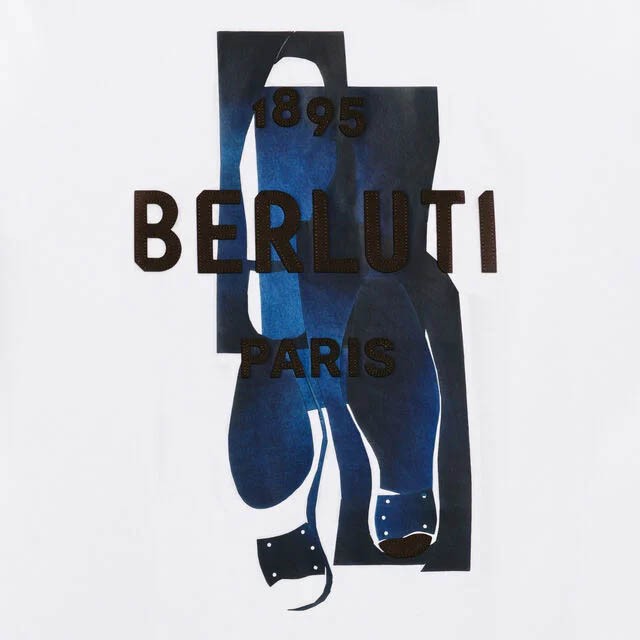
Despite this widespread shift, serif fonts remain a powerful tool for brands seeking to maintain a sense of legacy and craftsmanship. While many labels are opting for neutrality, others recognise the value in standing apart from the minimalist wave. A well-chosen serif font can evoke nostalgia, tradition, or artisanal quality—elements that are just as desirable in today’s market as modernity. The added detail in serif fonts can suggest a depth of history, making them a strategic choice for brands that emphasize craftsmanship and storytelling. Brands like Tiffany & Co. and Prada have kept their serif typography intact, proving that timeless elegance still has its place. Even in a world where sans serif is dominating, using a classic serif font can create a unique, recognizable brand identity that resonates with audiences looking for authenticity and heritage.

Choosing between serif and sans serif typography isn’t simply about following trends—it’s about defining what your brand stands for. A minimalist, sans serif approach can create a progressive, fashion-forward identity, while a classic serif can set a brand apart with heritage and sophistication. There’s no one-size-fits-all answer, and the best choice ultimately depends on the emotions and values a brand wants to communicate. Whether you embrace the contemporary shift towards sleek, modern typography or lean into the timeless appeal of classic serifs, the decision should be rooted in strategy rather than trend alone. The question is, do you embrace the movement, or do you create your own legacy?
